If you’re an avid user of the Elementor WordPress plugin, I’m sure you were as excited as I when they announced the global theme settings. All of those styles we were plugging into a CSS stylesheet to control the design of elements could now be controlled via the admin, right? Well, not exactly. Each release adds a few more properties and responsive controls, but there’s still room for improvement.
The new controls are powerful, but aren’t very efficient when applied to every element in your site individually. We need a set of reusable website building blocks with global styles already applied that can be placed where needed to construct our layouts.
To demonstrate a good use case, let’s build a website style guide out of Elementor Pro v3.0 templates and the global theme settings so our colleagues have a visual preview of the layout blocks they can utilize when building a webpage.
Theme Setup
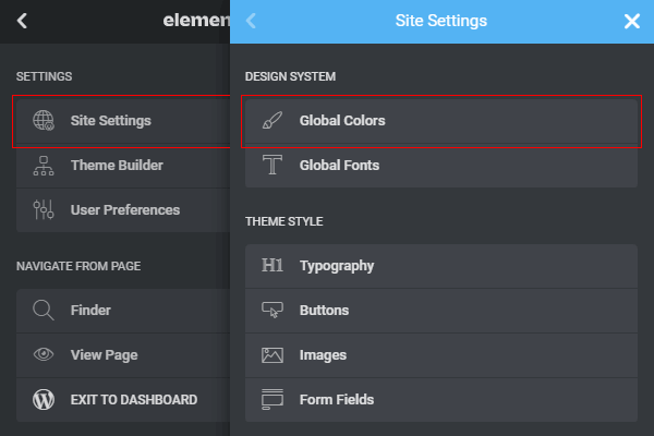
Open an Elementor Page and open up the Sidebar menu. Select Site Settings, then Global Colors.
Create a global color for each element property needed. Don’t forget about the hover state where relevant.
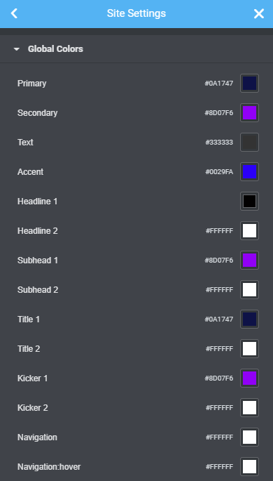
These are the color properties I typically create; utilizing a v1 and v2 to represent the element on a light background and dark background.
- Headline 1
- Headline 2 (Light color on dark background)
- Subhead 1
- Subhead 2
- Title 1
- Title 2
- Kicker 1
- Kicker 2
- Navigation
- Navigation:hover
- Breadcrumbs
- Hero 1 Text
- Hero 1 BG
- Hero 2 Text
- Hero 2 BG
- CTA 1 Text
- CTA 1 BG
- Button 1 Text
- Button 1 Text:hover
- Button 1 BG
- Button 1 BG:hover
- Button 2 Text
- Button 2 Text:hover
- Button 2 BG
- Button 2 BG:hover
- Button 3 Text (Alternate or outline button)
- Button 3 Text:hover
- Button 3 BG
- Button 3 BG:hover
- Link Button 1 (Link-styled button)
- Link Button 1:hover
- Link Button 2
- Link Button 2:hover
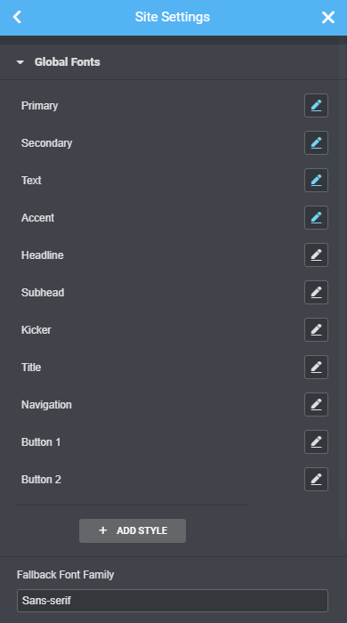
Back out and open Global Fonts. Create a global typeface for each element text property needed. Be sure to adjust size/line-height for responsive breakpoints. Feel free to change the default typefaces and also create separate versions for a dark background if you feel a need for that; probably not common.
Caveats:
Currently, you can only establish one global button look. Farewell, outline-button, you will be missed. Adios, reverse-button, my dark backgrounds will feel empty without your contrasting nature.
Reusable Button Template
That being said, let’s start by setting up our default button and I’ll show you how I work around this limitation later. Back out to Site Settings once again and select Buttons. Use the globe icon next to the Typography, Text Color, and Background Color properties to select your global values like so:
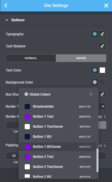
Now we have a global button style, so be at peace knowing your co-workers will be using your well-thought-out styling consistently.
Let’s deal with situations that require a second button style, like on a dark background. Drop a button into a section and set the section background to a dark color. Now change the button’s Style properties for Text Color and Background Color to the Button 2 versions using the globe icon like before. I also like to access the Advanced tab and fill in the CSS Classes, in this case with a button-2. That will give you flexibility for styling overrides later.
Now right-click on the button element’s top-right corner and select Save as a Global.

This will give you a re-usable Button 2 that can be dropped anywhere and unlinked to change its text and target url. The color and typography properties will maintain their global assignments even after unlinking.

Your new global buttons and other standard global elements, like headlines, etc. can be found under the Elementor sidebar’s GLOBAL tab:

Elementor Style Guide
That same technique can be used to build hero sections, grids, CTA sections and any other layout block you can think of. As you build, drop the global elements into a style guide page so everyone on the team has an accurate visual reference of each building block.

Any layout you save that’s a composition of multiple elements will not be stored in the Global sidebar. To insert one of those, use the gray folder icon within any new section.

Choose Insert to place the element, then Unlink it to change the text content.
This was a quick guide and I plan to flush it out in more detail as time allows, but I hope it gave you some ideas on how you can better use the Elementor Design System to build re-usable html blocks for your next WordPress theme.